Place Lift Marketing
← Website ReviewPREPARED NOVEMBER 4, 2026
WEBSITE REVIEW & REDESIGN PREVIEW

The Hillside.
A clearer path from
first impression to visit.

Prepared for The Hillside · Reference: VUE 2222

Place Lift MarketingHomepage review + proposed directionConcept for discussion
YOUR WEBSITEhillside2222.com ↗Existing homes, views, and community story
YOUR COMPARISONvue2222.com ↗Clear offer and visible tour invitation
WORKING GOALHelp buyers explore and arrange a visit.Assumption to confirm with the client
OUR ASSESSMENT

You have the story. Make the next step clearer.

Your photography, architecture, and natural setting give buyers reasons to explore. Bring the description of the homes into the opening screen, make availability easier to find, and give visitors a clear invitation to arrange a visit.

Keep your identity.

Retain the Hillside name, earth-tone palette, property photography, and emphasis on views, greenspace, and Northwest Austin. These assets give the redesign a strong starting point.

Learn from VUE’s buyer journey.

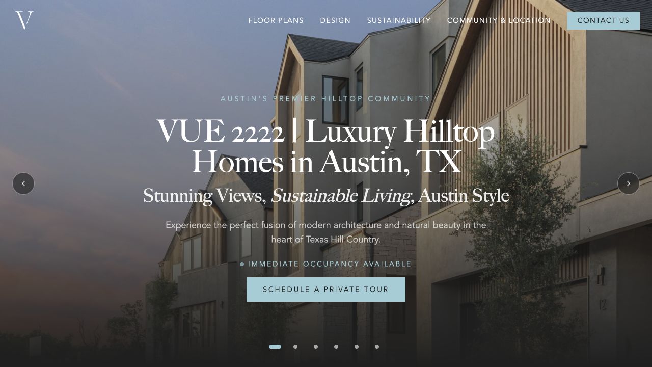
VUE identifies the homes and Austin location in its opening headline, includes a prominent tour button, and links directly to floor plans. Adapt that clarity to your own community.

01

Tell buyers what and where, immediately.

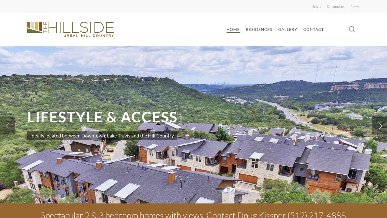
Observed: Rotating headlines emphasize design, lifestyle, and views. The two- and three-bedroom description appears below the opening image.

Change: Use a stable headline naming the homes and Northwest Austin location, followed by one concise supporting sentence.

Help a new visitor understand the offer at a glance.

MESSAGE
02

Bring availability and visits forward.

Observed: Floor plans are inside the Residences menu. The opening slideshow has no prominent availability or visit button.

Change: Add “Explore Available Homes” and “Schedule a Visit” in the opening screen; confirm inventory and destinations first.

Give interested buyers a direct next step.

ACTION
03

Give every image and section a job.

Observed: Design, lifestyle, and greenspace themes repeat in the slideshow and lower homepage sections.

Change: Organize the page around homes, setting, location, available residences, and a visit invitation. Pair each section with relevant photography.

Create a concise visual story that supports the buying journey.

LAYOUT
RECOMMENDED SCOPE

Homepage redesign + buyer-navigation refresh.

Revise opening copy, image hierarchy, navigation, and calls to action. Review the remaining pages before recommending a broader rebuild.

Before we build

Confirm buyer goals, availability, property facts, photo permissions, visit process, and mobile requirements. Agree on scope and price.

Based on the two public desktop homepages reviewed November 4, 2026. Screenshots capture one state of rotating slides. No analytics, mobile usability, technical performance, accessibility, or conversion results were audited. Recommendations are professional judgments, not measured outcomes.
THE STARTING POINT

Two homepages. Different paths to action.

Current Hillside homepage with landscape photography and rotating lifestyle headline
The Hillside · current homepage

Strong setting and identity. Bring the home description and buyer actions into this first screen.

VUE homepage with homes and Austin headline and a private tour button
VUE · comparison reference

A specific property headline and visible tour invitation give visitors a direct path forward.

YOUR REDESIGN PREVIEW

The Hillside, with a clearer invitation.

A proposed homepage direction using Hillside photography. Draft copy and property details require approval; this is a design concept, not a published website.

THE HILLSIDEURBAN HILL COUNTRYHomes   The Setting   LocationSchedule a Visit ↗
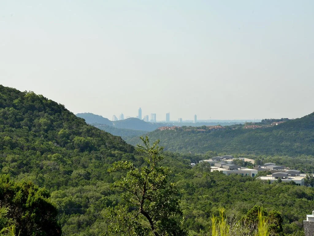
Hillside homes and Hill Country landscape
NORTHWEST AUSTIN · TWO- & THREE-BEDROOM HOMES

Modern homes.
Hill Country views.
Room to breathe.

Discover homes surrounded by nature, with access to downtown Austin and Lake Travis.

Distinctive architectureA natural settingNorthwest Austin living
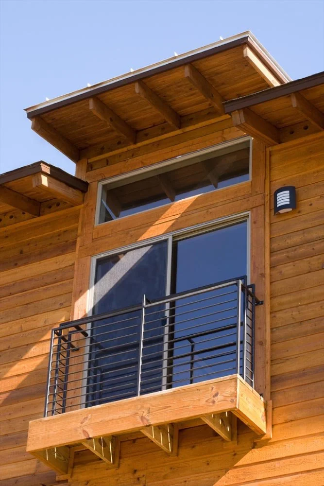
Architecture at The Hillside
A CLOSER LOOK AT HOME

See the homes.
Picture the everyday.

Explore the residences, discover the setting, and arrange a visit to experience The Hillside for yourself.

Find your next step ↗
01 · MESSAGE

The offer comes first.

The property type and location stay visible while the headline expresses the lifestyle.

02 · IMAGERY

The setting tells the story.

Large Hillside photography anchors the design, followed by a closer look at the homes.

03 · ACTION

The next step is clear.

Explore homes or arrange a visit, with destinations and inventory confirmed before launch.

What we would verify in the full project

Mobile navigation, readable type, image crops, form completion, current inventory, property claims, photo usage, page destinations, and accessibility. None should be presented as a verified improvement until checked.

YOUR NEXT STEP

Let’s shape the right version together.

Review this direction with us. We’ll confirm what fits, refine the concept, and agree on scope and price before work starts.

Discuss this direction ↗